
Back to work
Captain Cook Himalayan salt label
A bilingual label for pink rock salt in a clear jar, built to foreground the product's colour.
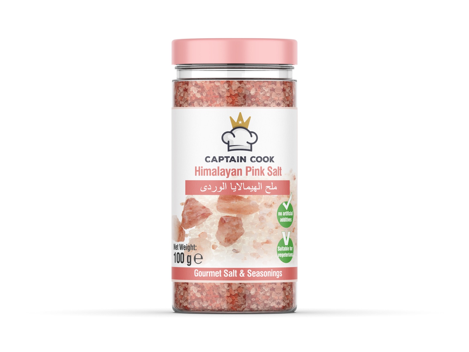
The selling point of Himalayan salt is its colour. So the only thing the label had to do was stay out of the product’s way.
We kept the label to the middle band of the jar and left the top and bottom completely clear. The white ground does not compete with the pink — it frames it.
The brand’s chef’s hat and crown emblem are in gold for a gourmet association. The product name runs in Turkish and Arabic side by side; certification marks are gathered into a vertical strip at the right edge, leaving the centre entirely to the product.